Simple steps to Flexbox Layout in CSS(Cascading Style Sheets)
Flexbox Layout


Flexbox can be referred to as Flexible Box Module, it was designed as a one-dimensional layout model, and as a method that could offer space distribution between items in an interface and powerful alignment capabilities. And also helps to make the web page responsive for both Mobile and Desktop.
This article will help you to know how you can use flexbox in CSS, which we will be exploring in more detail in the rest of these guides.
Let's begin.
FLEXBOX LAYOUT
Has it been explained above that Flexbox as being one-dimensional we are describing the fact that flexbox deals with the layout in one dimension at a time — either as a row or as a column?
The Two axes of the flexbox
When working with flexbox you think of two axes, which are the main axis and the cross axis. the main axis defines the flex-direction while the cross axis defines the perpendicular to it, but in this article, we are not going to be talking much about the two axes of flexbox but that this article serves as a solution to someone's problem when it comes to the responsiveness of a web page when designing it.
We know that Flexbox and Grid help in the responsiveness of a web page when using CSS when you intend not to use the libraries like (Boostrap or Tailwind or PostCSS).
The use of Flexbox Layout
Now, let's see how our code need to look like that will make our flexbox reflect and make our web page responsive
For the HTML
<!DOCTYPE html>
<html lang="en">
<head>
    <meta charset="UTF-8">
    <meta http-equiv="X-UA-Compatible" content="IE=edge">
    <meta name="viewport" content="width=device-width, initial-scale=1.0">
    <link rel="stylesheet" href="flex.css">
    <title>Flexbox explain</title>
</head>
<body>
    <div id="container">
<div>My Name is King Sardius and i am a Frontend developer and a technical Writer</div>
<div>My Name is King Sardius and i am a Frontend developer and a technical Writer</div>
<div>My Name is King Sardius and i am a Frontend developer and a technical Writer</div>
<div>My Name is King Sardius and i am a Frontend developer and a technical Writer</div>
<div>My Name is King Sardius and i am a Frontend developer and a technical Writer</div>
<div>My Name is King Sardius and i am a Frontend developer and a technical Writer</div>
<div>My Name is King Sardius and i am a Frontend developer and a technical Writer</div>
<div>My Name is King Sardius and i am a Frontend developer and a technical Writer</div>
<div>My Name is King Sardius and i am a Frontend developer and a technical Writer</div>
<div>My Name is King Sardius and i am a Frontend developer and a technical Writer</div>
<div>My Name is King Sardius and i am a Frontend developer and a technical Writer</div>
<div>My Name is King Sardius and i am a Frontend developer and a technical Writer</div>
<div>My Name is King Sardius and i am a Frontend developer and a technical Writer</div>

    </div>
</body>
</html>
For our CSS
*{
    margin: 0;
    padding: 0;
    box-sizing: border-box;
}
container {
    display: flex;
    flex-wrap: wrap;
}

.container > div{
    background-color: green;
    font-size: 20px;
    width: 100%;
    height: 100%;
    display: flex;
}
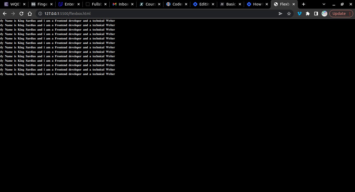
Then, After inputting our HTML and CSS code we are now going to check how well it shows Responsiveness on our browser
I will always encourage developers when creating a website or web page they should concern Mobile First before Desktop but the truth is that you will be using a Desktop or a PC for your coding In which makes you have an impression of desktop before mobile.. most clients will have to change the work you have done through there mobile phone and your website must be user friendly and extractive to the viewers
for Desktop users
For the Mobile Responsiveness using iPhone 6/7/8 plus
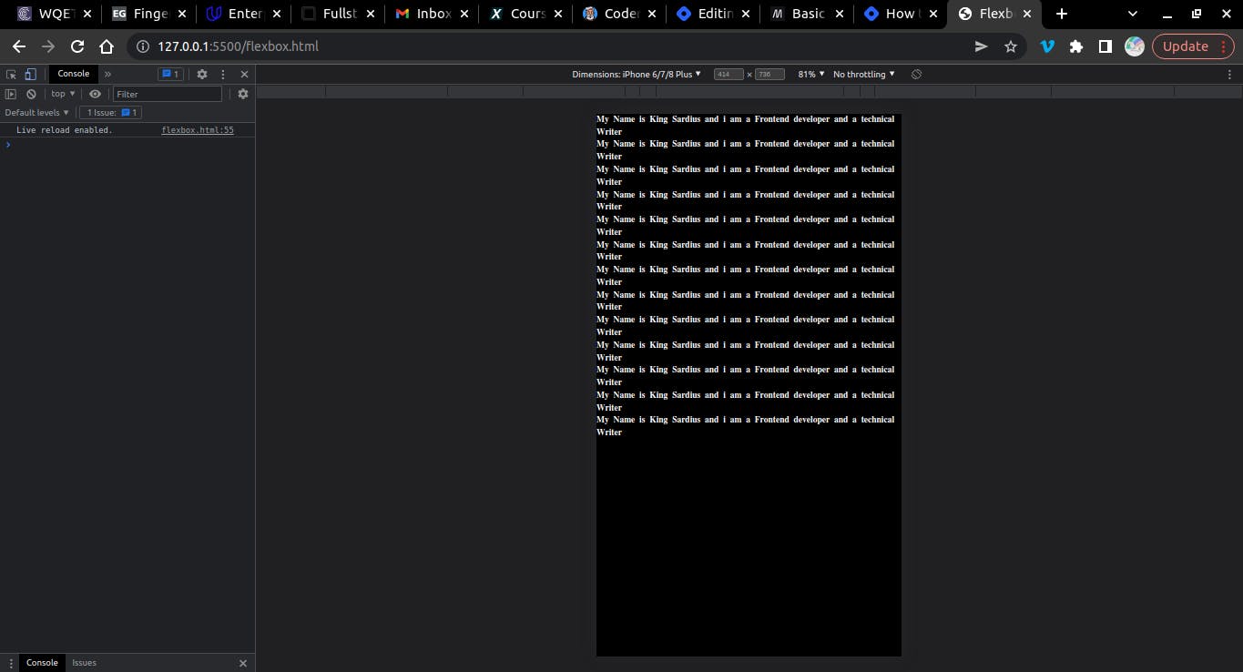
Now, there are many differences between the Mobile and Desktop view and it is done through the help of our Flexbox code.
I hope you learned something new, share with me your idea in the comment below about how this content has really helped you🤓🤓🤓
Don't forget to display;Flex;🤓🤓