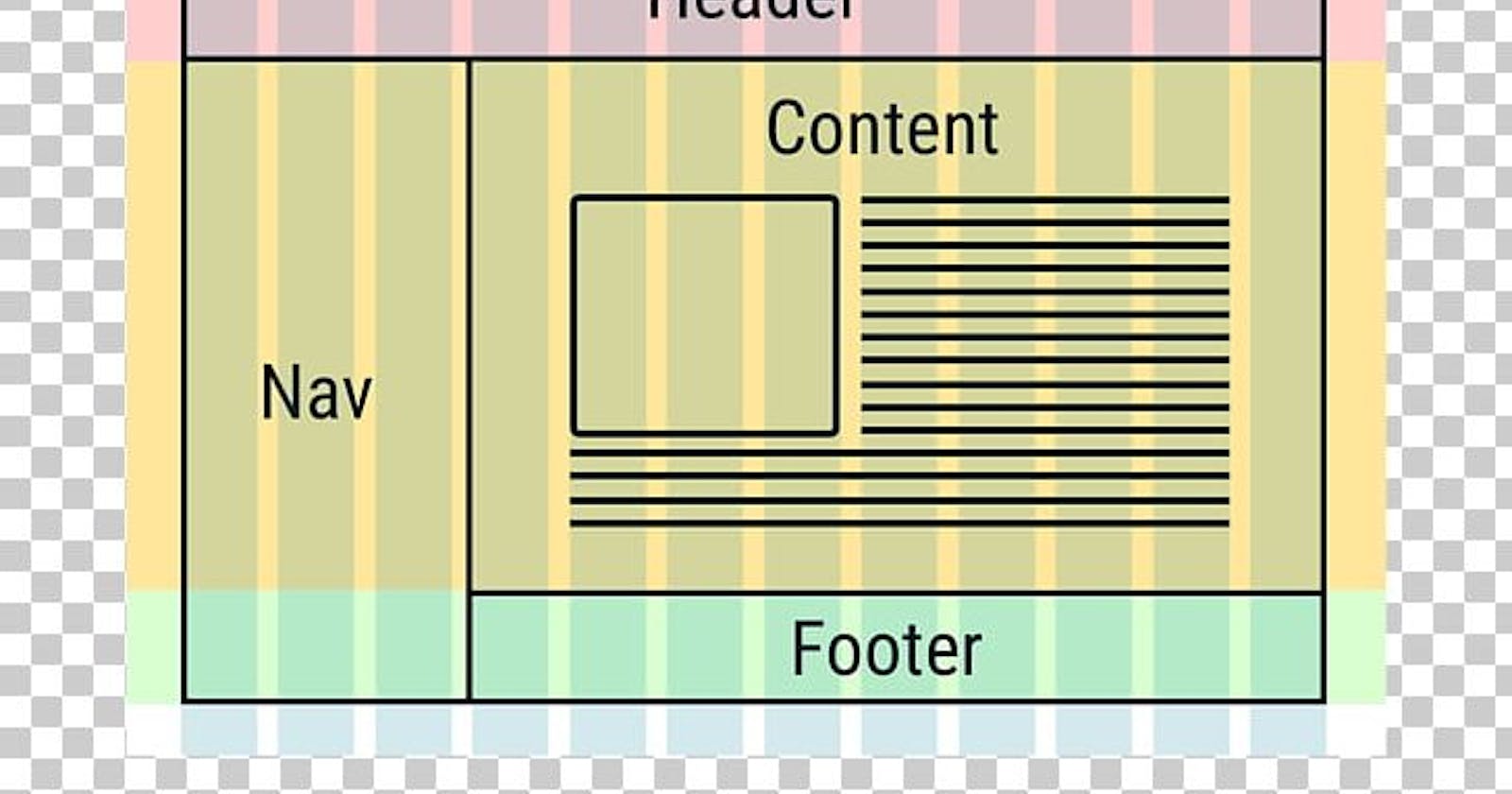
Grid Layout can help better Responsiveness using CSS(Cascading Style Sheets)
The CSS Grid Layout Module offers a grid-based layout system, with rows and columns, making it easier to design web pages without having to use floats and positioning.
This article will help you to know how you can use flexbox in CSS, which we will be exploring in more detail in the rest of these guides.
Let's begin.
Grid Layout As we all Know the grid layout I used in CSS makes the responsiveness of a website and it supports any browser, The grid properties are supported in all modern browsers which include Chrome, Firefox, explorer, safari

Grid Elements
A grid layout consists of a parent element, with one or more child elements.
<div class="grid-container">
  <div class="grid-item">1</div>
  <div class="grid-item">2</div>
  <div class="grid-item">3</div>
  <div class="grid-item">4</div>
  <div class="grid-item">5</div>
  <div class="grid-item">6</div>
  <div class="grid-item">7</div>
  <div class="grid-item">8</div>
  <div class="grid-item">9</div>
</div>
The outcome of our code is below!!!

when using your CSS we make use of display and if it is for flexbox layout we are going to use flex but for Grid Layout, we make use of the grid for the display, for better understanding, check the code below:
.grid-container {
  display: grid;
}
.grid-container {
  display: inline-grid;
}
All direct children of the grid container automatically become grid items.
Now, there are many differences between the Mobile and Desktop view and it is done through the help of our Grid Layout.
I hope you learned something new, share with me your idea in the comment below about how this content has really helped you🤓🤓🤓
Don't forget to display:Grid;🤓🤓
